2026
UPI fraud detection analytics
Two auditable fraud signals across 590K UPI transactions. I built it in SQL rather than training a classifier, so a risk analyst can retune a threshold in an afternoon instead of waiting on a retrain. That trades away some recall to keep the system explainable to the people who actually operate it.
Context
This is a fraud analytics pipeline built end-to-end — from raw transaction data to a decision-ready dashboard — modeled on how a BFSI or fintech fraud analyst would approach the problem. The dataset is the IEEE-CIS Fraud Detection set from Kaggle (~590K transactions). Tools: PostgreSQL, SQL window functions, and Power BI.
Rather than reaching for a black-box ML model, I used SQL window functions to build two independent, explainable fraud-detection signals: a rolling 30-day risk-scoring engine and a 10-minute transaction-velocity anomaly detector.
How I found the real problem
Fraud teams need signals they can explain, audit, and tune. A risk score from a transparent rule — for example, three or more fraud events in 30 days, or six transactions in ten minutes — is something a compliance team can defend and a risk analyst can recalibrate without retraining a model.
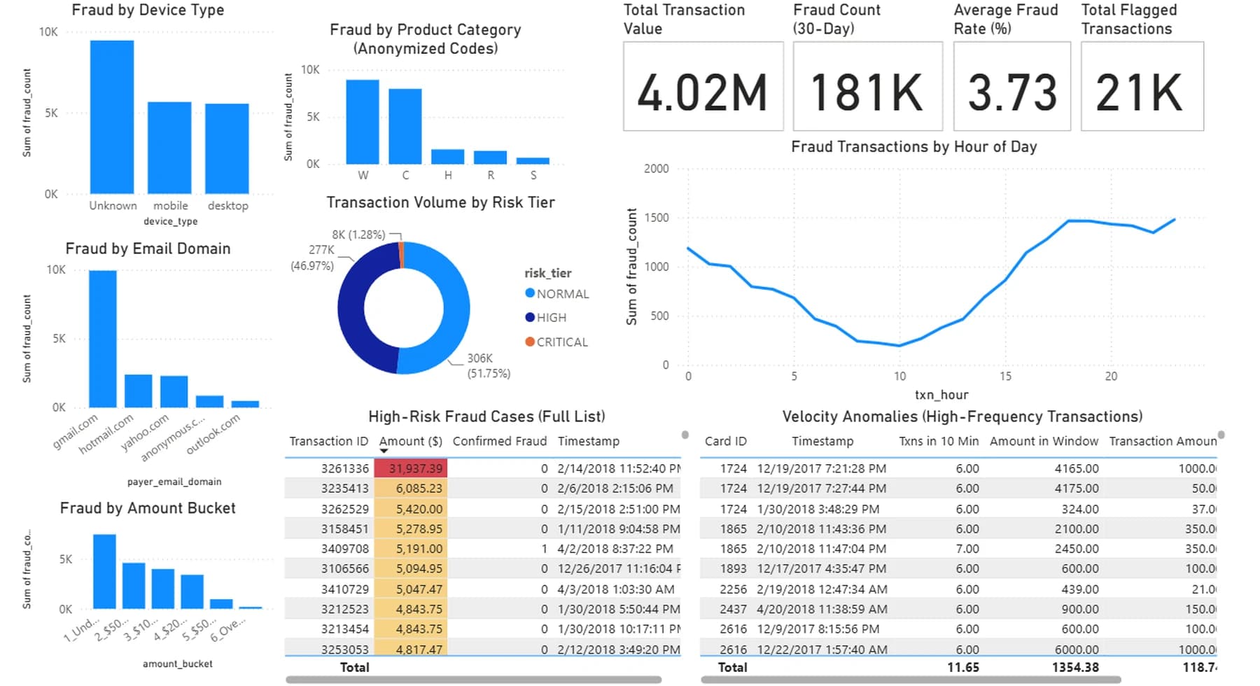
Category and channel breakdowns had to be cross-checked against base-rate effects before drawing conclusions. Gmail.com's dominance in the email-domain chart, for instance, likely reflects its overall market share rather than being inherently riskier — a reminder that concentration is not the same as signal.
What I did
I built the scoring logic entirely in PostgreSQL using LAG() and rolling SUM/COUNT window functions over time-based frames — the same techniques used in production fraud and risk systems, applied here at portfolio scale.
The dashboard surfaces time-of-day risk (fraud volume dips through mid-morning and climbs to an evening peak — roughly a 2× swing across the day), a Critical/High/Normal risk-tier split, velocity anomalies (cards making six or more transactions in a ten-minute window), and breakdowns by device, email domain, and anonymised product category.
The tradeoff I made
Each visual is built from a separate, pre-aggregated SQL export (fraud by hour, by device, by risk tier, and so on) rather than one unified transaction-level fact table. That was the right tradeoff for a focused, fast-to-build reporting layer — but it means the dashboard's cross-filtering is intentionally scoped, not universal. Clicking a bar in one chart will not reshape every other visual, because the underlying tables are not related to each other in the data model.
A natural next iteration would be rebuilding on a single shared fact table or a proper star schema to unlock full cross-filtering — the classic tradeoff between shipping a clear working V1 and building the fully generalised version.
Outcome
Two auditable signals shipped: rolling 30-day risk scoring and 10-minute velocity detection. The time-of-day view makes the ~2× intraday swing in fraud volume concrete enough to inform staffing or step-up authentication windows.
The risk-tier split came out unusually top-heavy (about 51.75% Critical). I flagged that as a candidate for threshold recalibration rather than treating it as ground truth — the finding was about the scoring cutoffs, not about the population.
What I'd do differently
Rebuild on a unified fact table so every visual can cross-filter cleanly. Validate the risk-tier thresholds against actual fraud outcomes rather than the rule-based cutoffs used here. Layer in a simple ML baseline, such as logistic regression, to benchmark against the rule-based scoring approach.
Full SQL scripts, the Power BI file, and a findings summary are in the public GitHub repository.